
Jewelry by Jeri
A playful charm jewelry brand built on one simple idea: choose your chain, change your charm. We redesigned their store so it feels as special as the pieces, and finally turns visitors into buyers.
Plenty of people visited. Very few bought.
Traffic was never the issue. The old homepage felt crowded, hid most of the collection, and gave shoppers little proof that real people loved wearing Jeri. Mobile felt especially cramped, so the brand never looked as high-end as the jewelry actually is.
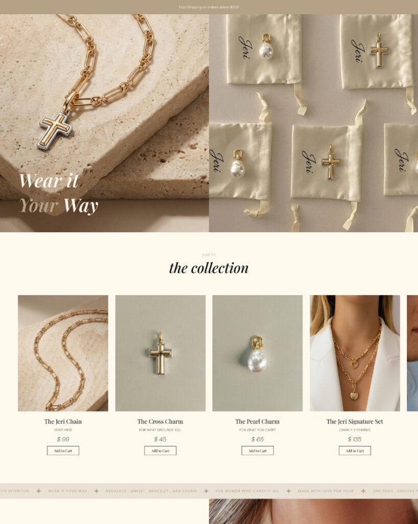
The Result
A calm, airy store with room to breathe on every screen. More of the collection is on show, customers wearing their charms appear right near the top, and real reviews build trust before anyone reaches the cart. The Jeri Signature Set now has its own spotlight.
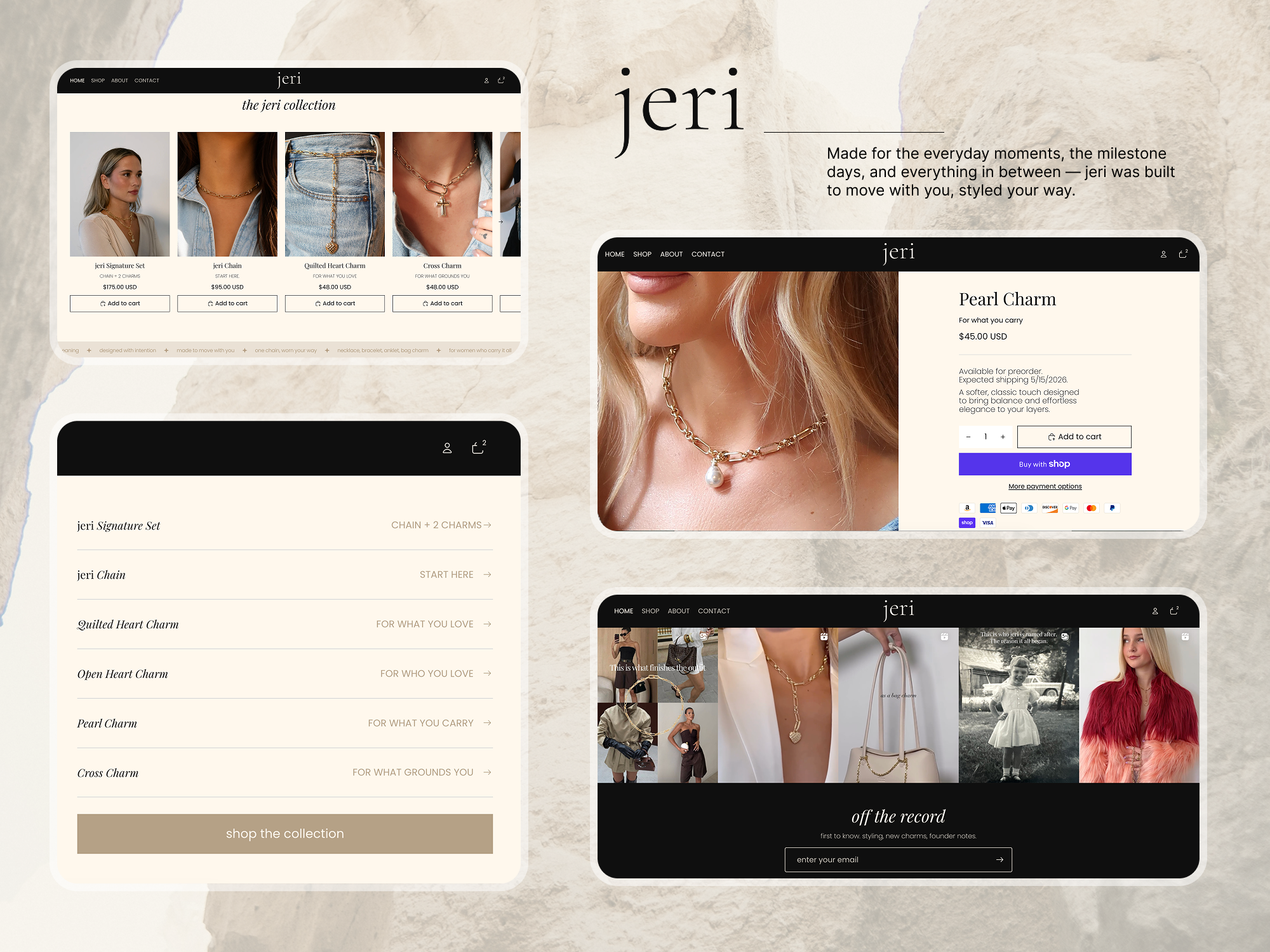
Tech & Functionality
Social proof up front
Instagram reels of customers wearing their pieces sit near the top, with real review screenshots throughout the page.
Review collection system
After delivery, customers get 5% off for a photo review, with a gentle reminder email if they have not replied yet.
Built to convert
A 10% off signup popup, a dedicated Signature Set banner and sale-ready sections for campaigns like Jeri Turns One.